Despite the almost infinite possibilities, visual originality is not something particularly present in the current video game. So when a title tries a different approach in terms of design, it's almost obvious that the testers will talk about it by favoring this aspect.
Trek to Yomi is one such game. Here is his story...

Trek to Yomi is a title from Flying Wild Hog, the Polish studio to which we owe the eccentric saga Shadow Warriors or even Evil West. In other words, he likes to do different things, to experiment with formulas, to go against the current.
In Trek To Yomi, we embody a samurai who must protect his village from robber attacks during the Edo era. Unfortunately for him and his village, things don't go as planned and soon our quest will turn into something more sinister and supernatural.
But let's not go further in the scenario to avoid any spoiler and talk about the visual.
THE famous visual that will set Trek to Yomi apart from its competition, ignite sales to unprecedented levels, overturn the balance of power with colossal publishers, desecrate cult saga like The Legend of Zelda or Dragon Quest, overthrow all world governments , mystify the... how do I make a fuss of them?
Well I admit. But it's only to convey a message: visual originality ≠ of a good game. game, the gameplay, he is fishing heavily by a serious lack of "Polish".
And there you should be completely figure 8 laughing at this superior pun. If not: Bordeaux Chenel.


Because a game, with such a rigid combat system that forces the player to suffer attacks without being able to really have the initiative, cannot offer real pleasure even for simulation fans. We come to a simple bludgeoning of blows, rather than evolving in the expanded panoply of blows that would be accessible as the parties progress.
But that's not all because, while we have the opportunity to face several enemies at once, they only come one by one, rather than attacking at the same time from side to side.
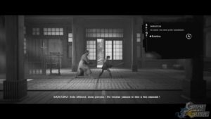
This set of flaws then makes the game boring and messy and it's not only the fault of clumsy exploration because it's imprecise because of commands which themselves get tangled up, particularly during the change of phases, but it's is also due to the visual design. It's black and white and some areas, fortunately rare, are so dark that you can't really see the action on the screen correctly.
It is therefore very disappointed that I find myself finding that the gameplay does not follow the artistic direction of the game. Because even if it hinders readability a little bit, it has the merit of offering something interesting whereas the gameplay, especially during fights, seems more unfinished than anything else...


