After some minor technical issues, I was finally able to reach the lands of Draenor and create a hordid character to get to Frostfire Ridge, the first area of the Horde for the expansion. Before going into more detail on the features that require it, I wanted to give a first overview of what has changed, especially in terms of the interface. Note that on live, I use many add-ons, so I lack perspective from the basic interface that I hardly ever see (but I went to compare with the PTS for you)!

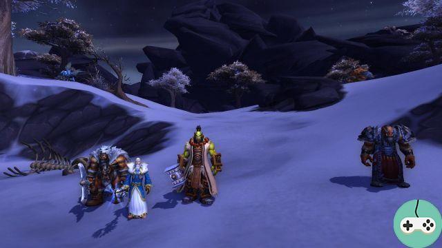
Durotan, the archive Khadgar, Thrall and the Long-voyant Drek'Thar
Interface
When you log in for the first time, even if you are in a still unknown region, it is not necessarily obvious that you are on the Warlords alpha because nothing has really changed at first glance.

Character Sheet & Statistics
The character sheet has not changed in itself, but we notice the arrival of new statistics and especially the adjustment of statistics (Item Squish). While my thief currently has 590 hit points, I end up here with 000 hit points. Granted, my gear is less (item level 47), but we still see a large drop, which should be around 677/500. And it's the same thing on the statistics, I go from 1 in agility to ... 10.

We end up with pieces of equipment worthy of Vanilla, not exceeding ten. Goodbye beautiful objects with 3550 Stamina. At the same time, with the rebalancing, it seems that 75 is enough!

Highlights
No particular changes on this side, but of course many achievements related to Draenor in the usual categories: quests, exploration, dungeons & raids ...

Map and quests
Quest log and map are now linked. As announced, the notion of secondary objectives now appears on the map in addition to the classic quests.

By clicking on the quest, on the right, we display the usual text, with the rewards (experience, gold, items ...).

Cards


Group Finder
No big changes yet on this side, it's in progress!

However, we notice the disappearance of the PvP icon at the bottom, in the menu, the PvP queues are now integrated into this same group finder.

Collections
The mounts / mascots button is now called Collections and offers 3 tabs: mounts, mascot codices and toys (toy box). Before moving on to toys, a quick new addition to mounts: a shortcut allowing you to summon a random mount among your favorite mounts. Being able to be placed in its bars, this shortcut will certainly appeal to the most collectors who never know which mount to choose (and we can have a blast on the alpha, the character having 535 mounts).

You can bookmark a frame by right clicking on the icon. A small star is then displayed on it. Along the way, you'll notice the Horde logo identifying faction-specific mounts. The interface for pets has not changed. We regret the absence of a button similar to the mounts, allowing to summon a random mascot.

I'm showing you (finally) what you've been looking forward to: collectibles. The functionality that will allow me to unclog my bank and my bags, having the annoying habit of collecting everything that is useless (but fun) from Vanilla.

Unfortunately, I don't have any toys on this character created for the alpha, so I can't test how it works yet.
Dungeon Codex
We already knew the names thanks to the data extracted from the client, but here is the codex of the dungeon in picture.

And here is the codex for raids.

As you can see, the names are still in English. I plan to make some videos for you if you want to see the models and the first information on the bosses.
Inventory
Two things have changed on the inventory side that will make your life easier. The first is the brush on the main bag: the automatic sorting. Have you collected lots of items and you can't find your way around? Don't panic, one click and all the objects are automatically sorted.

The second functionality is accessible with the toothed wheel on the icon of each bag. Through this, it is possible to assign each bag to accommodate a certain type of objects.

Even though I have been using an add-on for a while that allows me to display my inventory in the form of a single large bag, I admit that this addition could make me change my mind.
Portraits
Small change of layout for the contextual menu that opens by right clicking on my portrait. There are no more drop-down lists, the categories are now separated by lines.

We note the arrival of a third option for the difficulty of the instances: Legacy raids. The same layout has been changed for enemies.

Options
No more long undrinkable shortcuts list! Although most of us will certainly continue to use add-ons, it has never been easier to make shortcuts with the basic interface.

The advantage of not having the translations yet is to be able to immediately identify what is new in the options:
- Objectives : Fade Map When Moving
- names : addition of Subjects (Minor)
I hope I haven't forgotten anything about the changes. As indicated in the introduction, it is not always easy to identify all the small modifications made, offering a better quality of play.
What do you think ? Do not hesitate to tell me what you want to see from this alpha, I am at your disposal!


