After a great Blade & Soul followed by a very addicting Riders of Icarus, is there room for another F2P MMORPG this year? And above all does he deserve it? It must be said that B&S was very catchy thanks to its history and its dynamism while Riders of Icarus offered a very addictive familiar system. Finally, both titles offered beautiful graphics.
So what does the closed beta of Revelation Online have in store? Does it make you want it or not?
Are you late?
After a small update, launch of the game! We choose from the start the location of our server then pieces of an unknown language appear. It's not that boring, and I choose the only server available, which is EU_Beta1. At least it's self-explanatory as a name! This is where we start to laugh a little: there is a queue. Yes yes, we are in a closed beta, so where the keys are scrupulously distributed via many giveaways, drastic selections and founder pack purchases. And we end up with a queue. Best of all, the number is actually truncated, so if you read 700, it's actually 7000. It starts out great, and one of my colleagues explains to me that he is stuck in character selection. I never raged a game without having played it I believe, but it is done.
A few hours later: character creation
Okay, come on Revelation, we started our story badly, I'm already angry, but maybe you will show me your charms? After all, it's a CBT so I signed up to have some trouble! I relaunch the game a few hours later (Europe must sleep ...) and access character creation. This time, it's my resolution that's disgusting, a very exotic windowed thing. Great, it fits in the theme of the unknown language which has been lost in places. Obviously, we cannot access the settings at this time.
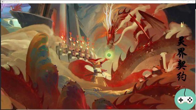
In short, I come to the choice of the class. The screen is really nice, I think it's an original presentation. When hovering over a class with the mouse, the image becomes slightly animated: fan effect and hair in the wind. I take the screenshot of Onidra:

I don't choose the same class as the chef, opting for the Spirit Shaper, who can heal. And there, when I confirm my class, it's party time. A 10-year-old girl thinks she's a Magical Girl, heading towards the character customization. God, there will be work, because unless you are a pedobear, it will be difficult to play with a child. On the other hand, I want to go watch an anime more than to gamer now, it's smart.

You want a candy ?
 By the power of the lunar prism….
 ... Transform meiii
Let's get serious again, it should be said: this animation is pretty, it shines everywhere, it's fluid and once again it's original.
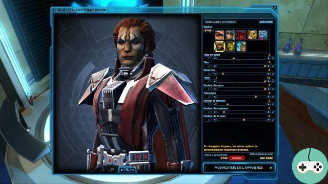
The character customization is very complete and easy to learn. We first choose the gender and the type of body which allows my avatar to age a little already. I must be puberty or almost this time!

Then comes the personalization, the real one, where you can easily go two hours without realizing it if you are meticulous. I first do a little tour in the presets, leaving on a basis that I like will save me time.

Then, different categories are available to refine your avatar as much as possible:
- Hair / Hair : 48 cuts are listed and a wide choice of color is available to you. If that's not enough, you can create your own colourway.
- Skin / Skin : choice of color, shine aka the layer of oil you want to apply to your skin. You never know, if there is a beauty contest quest ...

- Torso / Torso : upper body settings, we can do it with many parts: neck, shoulders, chest, arms, hands ...
- Legs / Legs : the same, but for the legs, the waist, the feet ...
- Bodysuit / Body : we adjust the size and overall build of the character.

The body is done, we go to the face!
- Skin / Skin : We determine the color of the blush, its luminosity. There is also a category of tattoos and distinctive signs. There is a bit too much for the forehead compared to the rest of the face. Here again we can choose the color and its density (of the tattoo, not of the forehead).

- Eyesbrows / Eyebrows : shape, color, angle, inclination, deviations, options are plentiful!

- Eyes / Eyes: As with eyebrows, you can customize your eye shape via a ton of settings.
- Makeup / Make-up: choice of the shape of the iris and the pupil of the eye, its color and that of the reflection, the color of the eye shadow, the choice of eyelashes, the color of the eye makeup, etc ...

- Lips / Lips: you can customize their size, make them plumper or not, show a slight smile or not, customize each lip separately. After all these details, there is still the color of the mouth to be determined, its brilliance, the contrast ...
- Last menu, Face / Face, allowing you to further adjust the different parts of your face, from the chin to the cheeks, from the gaps to the prominences ...

Make way for the game
My character is created, I embark on the adventure, impatient to find out what I'm getting into. The first images are very pretty ... And that's all because I don't understand. The narration is in, uh, Chinese? And there is no subtitle. What a shame for an MMORPG, even if it's a closed beta! How to give credit to history, to its very conception, if the latter is inaccessible? If it was that secondary, what good is the intro cutscene? Revelation gets a bad point, a very big one.


After this great introduction to which I have absolutely nothing, I take control of my character. Three choices are available to me, as Onidra explained in his overview:


The first impression I have of the environment is not transcendent. It does not have the charm of the landscapes of Blade & Soul for example, which despite its fairly simple graphics, had its patter. The characters are not very well animated, mine runs awry.
I accept my first quest and, nice little thing: my character speaks! No choice to make but seeing him express himself is a plus. NPCs are entitled to the same treatment which is really positive to enhance the dialogue of the quests. Here is finally a good surprise. It reminds me a bit of GW2.

I keep running from NPCs to NPCs with Aria (who looks like a tsundere) and Taku (calm, wise boy), my new friends who can't be very old either. In the end, I reach level 9 very quickly having fought only three critters for a quest. As much as I like the dynamism imposed by the little story at the beginning, even if it's a bit fun for kids, this ultra-fast leveling worries me. I hope that the speed of progression decreases a bit thereafter because, otherwise, in two days without forcing, we will reach the maximum level.
Let's review the skills I have. At the beginning I have four:
- Spirit Bell: inflicts damage on a target,
- Spectral Magpie: inflicts damage on an enemy and those next to him,
- Firefly Hex: inflicts Firefly's Sorrow on the target, a DoT,
- Essence of Spring: A healing spell that grants an additional, unexplained effect.

At 9th level, I get a fifth spell, an area of effect that hinders my targets in addition to inflicting damage on them. Very practical detail: the game does not just stupidly point out to me the acquisition of a new skill, it details what it does and recommends to me in which case to use it. There is also a third piece of information: the possibilities for skill development.

Another small detail of the interface that changes from what we are used to seeing: the presentation on the screen of the equipment we have just acquired. So it fits well. (On the other hand, the "Gift" icons at the top right, are we talking about?)

The unfolding of the story is quite fascinating if we disregard that each dialogue sentence is equal to a quest (no wonder that the leveling is done at the speed of light). It is regularly punctuated by mini-cinematics in addition to the particular interface of dialogue with the NPCs. I hope this is something that lasts and that it is not just to bait the new player.
In addition to movement phases mixing cinematics and action required on your part (like shift + W to make a demented leap) reminiscent of certain phases in Blade & Soul, there is another successful ingredient, seen in Aion this time: the wings, THE WINGS.
For the moment, I have only had the right to it briefly twice, an obscure piece of tutorial tells me that I will have my wings at level 2. It should be noted that, given the flood of information that can scroll through it. screen, you can quickly miss something in the heap. It's very messy as it is.

Let's come back to these famous wings. They are beautiful, the animation is perfect, the effect a little cartoon, as for our character, is well done.

Unfortunately, the game reminds me very quickly that we are in closed alpha beta and that it is not at all ready ...

Who stole my dialogue ?!
Menus do you want some, here are some
I'm going to dwell a bit on the interface, there are so many elements to dissect!

The very first icon simply allows you to configure this first menu which is located at the top left. There is then some classic information and various icons. The first gives access to Snapshot mode, which allows you to take screenshots using a few settings and the choice of emotes. A nice tool but could do better.

We have next :
- Chat Room: allows you to join / create a chat room. It can be restricted to a certain group and password protected.
- Battlewear Mode: Described as a way to move a stuck character, same for the next menu.
- Custom Interface Editor: customization of the user interface.
- Control Mode: allows you to change between the different control modes of the character.
- Hide Settings: allows you to display or not things and gimmicks.
Now let's look at the top right corner, which is mostly made up of the map. Above there is the possibility to change the "path" (channel). You can also see what time of day it is, the calendar (another gift corner), the mail, "The Way of The Warrior," The Assistant Office "and finally the map in full. Translations or pages are missing for some terms so I won't be able to explain them to you Besides, the official forum has lost its "localization" section, that made me smile ...
Below the map is the usual list of current quests.

We continue the exploration with the corners at the bottom right. First there are shortcut bars and then the illustrated menu of icons:
- Character, Wing, Folder: the character sheet, available wings and mounts, folder is empty.
- Inventory, Auction, Shop: the inventory, the auction room and the personal shop (level 40 if I have followed correctly, as for the auction room)
- Skills, Actions, Craft: all your skills, untranslated actions and emotes, crafting. Lots of languages come together in the craft book, it looks like a mad scientist's grimoire.
- Group, Squad
- Guild
- Job, which appears to be a special quest log, starting at level 15.
- Friends, Chat, Camera: Chat and Camera simply repeat the same as the menu at the top left.
- The Battlefield, Arena: The PvP Corner!
- Achievements, Rating, Collection: Achievements, player rating, and collectibles.
- Events, Return: Level 20 required for events.
- Settings: settings (no kidding)

We end with the central element: our spell bar. For my Spirit Shaper, the bottom bar is filled with skills generating "Fauna" while the other two placed on either side of the symbol are special spells, using Fauna. This resource is represented by the symbol in the center. The more there are, the more powerful my skills. The first special skill I received, Deer Stampede is super boozy and ignores 50% of the enemy's magic defense. It is a reindeer that I send on the enemy. Father Christmas could be inspired by it against ill-mannered children.

Let's resume (and conclude) our adventure!
It's time to leave my little village and explore the world. Finally some action with some fights! New landscapes, more neat, even if graphically we are below the competitors. The animation of the characters lacks fluidity (when it is not all broken). The adventure leads me to my first solo raid, Darkfall, a nice instance that won't be a problem for me. I am already reaching level 20! I now have access to daily challenges, allowing me to gain bonus EXP. I take this opportunity to redo the Trial of the Four Kings solo dungeon.
The story turns out not so bad, but it will take a completed translation to be able to fully judge. This is really the big black point of this beta. Even if it was specified that this CBT is used to test their equipment and infrastructure and that we would certainly encounter translation problems, queues, etc. the test when there are holes in the scenario.
This closed beta shows few technical concerns for me. I browsed the game forum where we see that others have for example drops in FPS. The latter lacks organization, being satisfied with a single category to report bugs. I prefer it when it's a little tidier, like "installation problems" and "problems encountered in game" at least. There it is a happy mess! It also lacks a list of known issues, it has not been updated yet. CBT started on the 3rd, at the time of writing it is the 6th (midnight sharp!) And there is still some expectation to see official interventions at this point (Note: and Monday, still nothing! ). Finally, I had no luck, the forum was unavailable when I wanted to post there. I would have appreciated a form directly in-game, it has already been seen and I find this feature very practical. Maybe that will come later when their beta is about the game itself and not the hardware side.
In the end, Revelation Online is clearly not essential at the moment. Those who have nothing more to do with their MMORPG at the moment will eventually be able to check it out while waiting for the key update of their beloved game to pass the time. But you probably have better things to do, with all the games released lately. If so, I assure you: you have better things to do.


