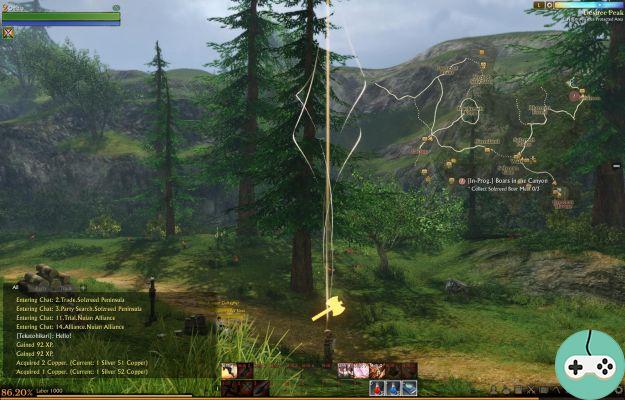
You are probably wondering what the ArcheAge interface looks like! The interface is rather classic but offers some rather practical options to configure it to your liking. Here's what it looks like when you first enter the game:

Below
Along the entire length, we find the experience bar. Above it is the bar of labor points. We regenerate 5 every 5 minutes, regardless of whether we are connected, for a maximum of 1000. Or 200 minutes (3h20).
Left: discussion
The chat window can be maximized / minimized and moved. You can create tabs and check the different channels to display. Among the discussions, we find the usual channels.

Middle: my skills
On the lower bar, I have the 3 basic skills of my "skillset" (archery), as well as potions (mana / life) and a teleportation tome. On the second line, I have an dodge spell (which increases running speed by consuming mana) and an interrupt. I finally have spells on the far right to dance, teleport to a Recall, play music, drop resource packs and use a hang glider.

Thanks to the small arrows next to (1), you can change the lower bar.
Right: the menus
In order, we find:
- character sheet with statistics, titles and worn equipment


- l'inventory with the possibility of creating personalized tabs (by checking the types of objects that you want to appear in a new tab) and to sort automatically. You can directly expand your bags from the inventory. From the help on the inventory, you can see the different quality levels.


- the diary of quests

- les skills


- la carte : the world is gigantic!


- les vocations with different rankings, public farms and access to its trades.

Regarding trades, if you click on an icon, you end up with a long list of recipes. Here is for example for the kitchen and the trade:


- la community gathers windows of friends, enemies and families, as well as raids and guilds. Regarding the family, if you remember, there is a channel to chat with his family!


- les messages

- finally, in bulk, we have a home button (grayed out),can help (which open internet pages) and options (with the shortcut to select his character and close the game).

A haut
Left: my character
Directly, we have its level, its nickname, its class (skillset), as well as its reserve of life and mana. If we hover the mouse over it, we get more information.

Right: time, zone and mini-map
The mini-card is available in 3 sizes: small, medium and large. You can also activate or deactivate the icons or simply hide the entire minimap.


We also have the time (in the game) as well as the time of day. Above, we are at the end of the evening when it was daylight there:

Between
Fortunately, there is nothing in the middle, so you can see the beautiful landscape! We just find the list of quests that can be hidden.

And by way of conclusion, a video, where I present the interface in sound and images!


